

We go by each day growing through multiple web browsers for our work, studies, or entertainment. It’s incredible to think that programmers can make endless possibilities in the structure, design, and commands through an HTML or HyperText Markup Language. As much as content is essential in a website, including multiple images through your HTML can make your program stand out. Horizontal placement is easier to see since our eye movement reads from left to right, and so, if you’re a new programmer and want to learn how to align multiple images in HTML horizontally, worry no more! In this article, we’ll be listing the five ways on how to align multiple images in html horizontally.
Before we proceed with the 5 ways, I would like to thank bolchevaerk.dk that has helped realize this article!
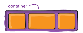
1. Flexbox
A flexbox or flexible box model is a relatively new layout method for programmers to adjust a website’s vertically or horizontally layout structure through rows or columns. You can change the image’s length or width to fill or shrink to a given space in the layout through the flexbox container. Another feature that comes with using the flexible box is predicting an image’s proportion and placement as to the screen size and display device of a viewer.
To use Flexbox to align images in HTML, here horizontally are the steps you need to do:
- Open a new HTML document to avoid mixing your new commands and codes with the main document.
- Insert your desired images into the new document. Since you will be using Flexbox, you need to put a div which you will put “images-container” below. The number of <img src> you include depends on the number of images you want to be in the horizontal line.
- Include the following CSS in your HTML:
- Write “images-container” and include the properties “display: flex;” and “justify-content: center;.” As mentioned earlier, Flexbox helps to predict the adjustment of an image in proportion to a device’s display screen—so, that’s the use of “display: flex.” As for “justify-content: center,” this places all your encoded images on the website at the center, horizontally.
- Although optional, you can improve the visual presentation of your website’s horizontal images by adding your desired margin for each picture. To do so, you must write another “images-container” and input “margin-left:” then insert your selected pixel or px range. Also, do this procedure for “margin-right.” For reference, 96 pixels is equivalent to one inch.
2 . Prevent Wrapping
One of the most annoying things a programmer, designer, or even a student experiences when writing on a document that involves a text that needs to insert an image is wrapping. Wrapping happens when text wraps around images in a specific position, making both the items converge instead of initially placing images in a particular position. In the CSS of your HTML, wrapping happens when a text automatically adjusts around the image, moving the words or image to a different line, preventing the horizontal alignment of your desired multiple photos. To prevent wrapping, you need to do the following steps:
- Under the main #content element, include the “whitespace:nowrap”. Nowrap removes the typical whitespace in your website but prevents images from breaking from its lines.
- Alternative to “whitespace:nowrap” is “word-break:keep-all.” However, this generally works on text wrapping but is still significant if you have text next to your series of images that can affect its alignment.
3. Display:inline-block Method
The primary purpose of the display:inline-block is to place an image or any element into a block container that is in the same alignment level together with other pieces you include in it. Once an image is in this property, you can still adjust its width and height values while still having its content adjacent to each other. This property allows you to have multiple images horizontally as long as you place them in these display blocks. By inserting the “display:inline-block” into your HTML, you can do this.
4. Change display:block to float:left
A float is a property that makes your image move its position—usually either to the left or right part—on the container you’ve assigned it in, which makes texts (annoyingly) wrap around it. If you’ve placed multiple images in one container without specifying which direction the images must float into, then chances are all their alignments will be horizontal. To avoid this, you must either:
- Write “<p style=” clear: both;”> to prevent the succeeding texts from wrapping or floating to your contained images. After doing this, your website will have an invisible horizontal line that will make all new images or texts start from a separate paragraph.
- Write “float: left” to the .images class to make its placement in the container start from the left. In doing this, you make sure that all the following images will also follow their alignment. Thus, you will see multiple photos in a horizontal alignment in your HTML.
5. Check if the Element Body is 100%
There are some instances where multiple images cannot align horizontally because the height is not 100%. You can try writing “margin 0: auto” or “text-align: center” to your images in a block element. You should include either of the given texts under the parent command. However, this solution does not work in all browsers, but most of them. You don’t need to worry if your HTML browser belongs to Microsoft Edge, Google Chrome, Opera, or Safari, as this function works for them.
If you are searching for an excellent image manipulation service, go to fixthephoto.com and see what cool stuff they can do with your images to make them look even better.
Takeaway from the guide: How to align multiple images in HTML horizontally
You can make a boring, scrollable’ website turn into a head-turner by inserting eye-catching images. However, doing your website can take up your time since you need to input many codes. Knowing how to align multiple images in HTML horizontally can be an advantage whether you’re a passionate web programmer, freelance worker, or long-time web designer. Hopefully, after learning the three ways to do the task, you may find one solution easier or more complicated than the other—and that’s okay. As a programmer, you should do the procedure that you find most effective and convenient, however long or short it may take, as long as you’re not risking the quality of your output.
Also read our guide on How to clear Form Data after Submit in HTML


