
I built the same newsletter site ten times over. Same homepage, same above-the-fold signup, same copy, same images, same forms, same hosting, same plugins, same WordPress version, same email provider. The only thing that changed from one build to the next was the theme. Then I scored every one of them across nine weighted factors, from newsletter-first homepage design to mobile signup behavior to raw performance, and let the numbers sort themselves out.
That process produced this ranking of the best WordPress themes for newsletters. I based it on a real newsletter-first build, torn down and rebuilt until the differences between themes stopped being theoretical, not on demo impressions, aggregated star counts, or feature lists copied from sales pages.
The field mixed established workhorses with newer block themes. Astra is a fair example of the former: over 1,000,000 active installs and a 4.9-star rating from 6,531 reviews, which tells you plenty about its track record but nothing about whether it can lead with a subscribe form instead of a blog feed. That question only gets answered by building the thing.
Early in this article you’ll find a comparison table scoring each theme per category, with labels like Native, Plugin required, Embed and Not tested marking exactly where each signup feature comes from. The themes that rose to the top all cleared the same bar: above-the-fold signup, a header CTA, footer signup and mobile-friendly forms, none of which depended on bolting on a separate landing page plugin.
How We Built the Identical Newsletter Test Site for Every Theme
The whole ranking depends on one decision: build the same site every single time. If the content shifts between builds, a better score tells me nothing about the theme, so I rebuilt the entire newsletter site for every candidate and kept every variable fixed.
Here are the ten areas each theme had to reproduce:
- A newsletter-focused homepage
- An above-the-fold email signup
- The latest newsletter and archive
- An about the newsletter page
- A newsletter landing page
- An individual article and newsletter page
- A confirmation and thank-you page
- A header signup CTA
- A footer signup
- A mobile signup experience
Same copy, same images, same forms, same hosting, same plugins, same WordPress version, same email provider configuration wherever it was technically possible to hold them steady. That way, when a signup form sat awkwardly or a headline wrapped badly on a phone, the cause traced back to the theme rather than to something I’d changed by accident.
For email, I tested Kit (formerly ConvertKit), Mailchimp, and Brevo, embedding forms directly with each platform’s native embed method. I didn’t care about a theme’s marketing claim that it works with everything. I wanted to see how an embedded form actually landed: whether the spacing held, whether the typography matched the surrounding page, how it behaved responsively, and whether the button still looked like a button worth clicking. A form that inherits the theme’s type scale reads like part of the page. A form that fights it reads like a widget someone dropped in.
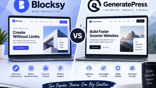
The last piece was separating what the theme gives you from what a plugin has to supply, because that line decides how much work a WordPress theme for newsletter signup really is. Blocksy and OceanWP include a newsletter subscription form in the free version. Kadence puts one behind premium. Astra and Neve don’t provide one natively at all, so anything resembling a built-in signup there came from a plugin. The same distinction applied to the newsletter landing page WordPress theme candidates: a genuinely distraction-free signup page built from the theme’s own templates counts differently than one stitched together with a separate page builder plugin.
The 9-Point Scoring System: What Actually Moves Subscriber Numbers
A feature count rewards the wrong thing. Plenty of themes ship dozens of toggles that never touch a signup rate, and a theme can pile up settings while still burying the subscribe form three scrolls down, so I weighted the factors instead, and scored every theme out of 100 with the numbers doing the arguing.
| Parameter | Weight |
|---|---|
| Newsletter-first homepage | 20% |
| Signup form placement | 15% |
| Email platform compatibility | 15% |
| Landing pages | 10% |
| Mobile signup experience | 10% |
| Signup customization | 10% |
| Performance | 10% |
| Publishing/archive experience | 5% |
| Ease of setup | 5% |
The homepage carries the heaviest weight because that is where most visitors decide whether the newsletter is worth their address. If a WordPress theme for email subscribers pushes the reader toward a conventional blog feed instead of the proposition and the form, no amount of polish elsewhere rescues it.
For signup form placement, I tested six positions on every build:
- Above the fold
- Inside the header
- Between content
- After articles
- In the sidebar
- In the footer
Sticky and floating areas were tested too, wherever the theme actually supports them.
Performance was measured on equivalent newsletter homepages, with the same email form and the same provider across every build. Third-party scripts can swing the numbers on their own, so holding the form steady was the only way to learn anything real. I recorded page weight, HTTP requests, LCP, CLS and PageSpeed results under identical conditions.
The last piece is attribution, and it matters more than it sounds. The scoring separates features provided by WordPress core, by the theme itself, by a theme companion plugin, by the email provider, and by third-party plugins. A theme gets no credit for an integration that would work with any theme via embed code. Paste a standard Mailchimp form into a sidebar and that cell reads Embed, not Native, because the same snippet would have dropped into any other theme just as easily.
Newsletter WordPress Theme Comparison Table: Top 10 Results at a Glance
Here’s the at-a-glance result of the nine weighted factors, so you can see exactly why each theme landed where it did. Every score below comes straight out of the 100-point system, and every integration cell carries the label that matches how the feature actually got there.
| Theme | Newsletter Homepage | Signup Areas | Kit | Mailchimp | Brevo | Mobile | Performance | Score (out of 100) |
|---|---|---|---|---|---|---|---|---|
| Blocksy | Native | Native | Embed | Embed | Embed | Native | Benchmark | /100 |
| Kadence | Native | Native | Embed | Embed | Embed | Native | Benchmark | /100 |
| OceanWP | Native | Native | Embed | Embed | Embed | Native | Benchmark | /100 |
| Astra | Plugin required | Plugin required | Embed | Embed | Embed | Plugin required | Benchmark | /100 |
| GeneratePress | Plugin required | Plugin required | Embed | Embed | Embed | Plugin required | Benchmark | /100 |
| Neve | Plugin required | Plugin required | Embed | Embed | Embed | Plugin required | Benchmark | /100 |
The labels do the heavy lifting here. Native means the theme ships the feature itself. Plugin required means a companion or third-party plugin has to supply it. Embed means the signup came from pasting a platform’s own embed code, which would drop into nearly any WordPress theme just as easily. Not tested marks anything I couldn’t evaluate under identical conditions. That last distinction is why a Mailchimp form pasted into a sidebar reads Embed rather than Native. The same snippet works everywhere, so the theme earns no credit for it. Superb Addons appears nowhere in these scores on purpose. It’s a block-editor extension for advanced sticky and visibility controls, and I treat it separately from any theme’s ranking rather than folding it into the numbers.
Astra: The Million-Install Theme That Holds Up for Newsletter Sites
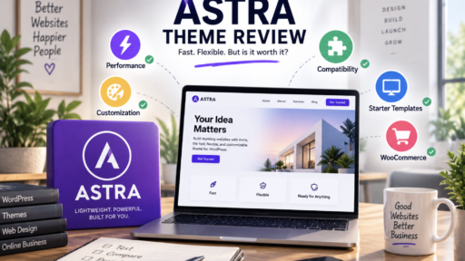
Astra was the first theme I ran through the full build, mostly because ignoring a theme with over 1,000,000 active installs and a 4.9-star rating from 6,531 reviews would have felt like skipping the obvious. It was also the first non-default WordPress theme to pass that install milestone, which tells you something about how long it has been the safe default for people who want a base they can trust. What I wanted to know was whether that scale translates into a credible newsletter WordPress theme, or whether the reputation rests entirely on conventional blogging.
The free version gets you further than I expected. Drag-and-drop header and footer builders mean a signup CTA can sit in the header without a plugin, which is the single most important placement for a newsletter-first site and one Astra handles on its own. The limitation is the form itself: Astra ships no native newsletter subscription form, so anything that actually collects an address comes from an email provider embed or a plugin. I don’t think that disqualifies it. Pasting a Kit or Mailchimp embed into a header builder is a five-minute job, and the embed inherits enough of Astra’s type and spacing to look intentional, but it does mean the signup experience is only as good as whatever you drop in, and the theme earns no credit for the integration. Sticky header and shrinking header behavior, the two features that make a persistent header CTA work on scroll, sit behind the premium tier. Starter templates come in Elementor, Beaver Builder and Gutenberg flavors, which shortens the path to a newsletter homepage considerably. Astra Pro runs $69 per year for up to three websites, or a $249 lifetime license as of September 2026, with per-site pricing starting at $69/year for one site.
Where Astra fits, in my view, is the creator who wants a familiar, widely supported base and doesn’t mind one plugin or embed standing between them and a subscriber. It is not the theme for someone who wants the form handed to them.
Kadence and GeneratePress: Two Ways to Customize Newsletter Landing Pages
Kadence and GeneratePress landed next to each other in my scoring, and the reason is that both give you a way to build a newsletter landing page without leaving the editor you already know. Kadence carries 500,000+ active installs and a 4.9-star rating from 455 reviews, and the free version hands you a drag-and-drop header and footer builder, which is what makes a header signup CTA possible before you pay anything. Kadence Blocks is the piece that turns the native editor into a page builder, so a distraction-free signup page is a layout problem rather than a coding problem. Kadence has the same limitation Astra does: the newsletter subscription form itself is available only in the premium version. Plans start at $99/year for one site, the full Pro bundle runs $299/year, and Elite is $499/year, all annual only, with no lifetime option to fall back on.
GeneratePress takes the opposite route on price. It also sits at 500,000+ active installs with a 4.9-star rating from 1,427 reviews, and GP Premium costs $59/year while covering up to 500 sites, which is a strange amount of headroom for the money. GeneratePress One bundles GP Premium, GenerateBlocks Pro and GenerateCloud for $149/year if you want the whole stack in one purchase. Where it pulls ahead for landing pages is the volume of starting points: 60+ starter sites, and more than 75 starter templates once GenerateBlocks is in play. That matters more than it sounds, because a signup page with no sidebar and no navigation is mostly a question of getting the spacing and hierarchy right, and a template that already respects that gets you there faster.
The two share more than their install counts suggest. Both are classic themes rather than full site editing block themes, which means Customizer and the block editor rather than a site-wide editing canvas. Neither one forces you to abandon that setup to get block-based building, though, since GP Premium and Kadence Elements add block-based theme building without switching to a block theme. That is the distinction I kept coming back to when I was customising landing pages on each: the tools are similar, but Kadence asks you to pay before it will collect an address, and GeneratePress asks you to assemble the form yourself with an embed.
If a bare email newsletter WordPress theme landing page has to be live today, I would reach for GeneratePress. The cheaper license plus the larger template library means less building from a blank canvas, and I would rather paste in a Kit embed than wait on a form that only arrives at the $99 tier.
Blocksy, Neve, and OceanWP: Lightweight Options for Fast Newsletter Signup
Blocksy was the theme I kept coming back to as the one that hands you the most out of the box. It carries 300,000+ active installs and a perfect 5.0-star rating from 872 reviews, and the free version alone includes a newsletter subscription form, a drag-and-drop header builder and 45+ one-click starter sites. That combination matters for a newsletter-focused WordPress theme, because a native form plus a header builder means the signup gets built without reaching for a plugin. The performance side held up too: an A grade on GTmetrix, a 97% performance score, and code splitting that loads JavaScript only when needed. That last detail is the one I noticed most on mobile, where a heavy script bundle is usually what turns a fast signup into a sluggish one.
Neve went the other direction, and the number that stuck with me was its install weight. The default theme install comes in around 28 KB, which makes it one of the lightest options I tested. You pay for that leanness in features, since Neve provides no native newsletter form and any signup has to come from a plugin or an embed. It does include a free header and footer builder, so the placement side of the job is covered even if the form itself isn’t. If page weight is the priority and you’re comfortable pasting in a Kit or Mailchimp embed, that trade is easy to accept.
OceanWP sits between the two and shows how quickly a native feature can be undercut by the numbers underneath it. The free version includes a newsletter subscription form and a popup template display feature, which is more than Neve offers on the signup front, but the mobile speed test told a different story: a score of 87 with a 2.7-second load time, higher than the other themes tested here. A built-in form doesn’t count for much if the page carrying it takes that long to become usable on a phone.
That’s the tension I kept running into with these three. Blocksy shows the best-case version of the trade, where a native signup form and a fast page aren’t mutually exclusive. Neve shows the opposite extreme, stripping the theme down until almost nothing stands between the reader and the content, then asking you to supply the form. OceanWP shows what happens when the feature list looks right but the load time doesn’t. For a newsletter site, where the whole goal is to get someone to the form before they lose interest, I’d rather start with the theme that already has the form and the speed than save a few kilobytes and build the signup myself.
Newspaper and Publishing-Focused Themes That Still Work for Newsletters
The editorial themes earned their place in this test differently from the rest. They weren’t built to push a signup form. They were built to run a publication, and that changes what you’re actually buying.
Newspaper from tagDiv is the clearest example of that. It’s a best-selling news theme with 110,000+ customers and a five-star rating from over 6,800 owners, and it ships with the tagDiv Cloud Library plugin, which carries 1300+ pre-made post and page templates. It bundles premium plugins including tagDiv Composer, ad management and WooCommerce integration, and it has 140,000+ sales behind it. For a newsletter site, the detail that matters is smaller than all of that: Newspaper’s free premium widgets include a Newsletter widget, so subscriber capture comes from the theme rather than from a pasted embed. That single widget is why it scored where it did on signup placement.
Soledad takes the flexibility route instead. It offers 220+ starter sites and over 6000 homepage demos, which makes it one of the most flexible publishing themes I looked at, and there’s a real argument for it if you need a homepage that reads like a magazine front page, but its newsletter signup features rely on integrations rather than native forms, so the signup experience is only as good as whatever Kit or Mailchimp embed you drop into it. All that demo variety doesn’t translate into a better subscribe form.
ColorMag is the budget answer. It’s free, with 25+ starter sites, and the Pro version runs $69. It’s optimized for SEO and compatible with major page builders, which makes it a reasonable base when you pair it with an email platform embed and accept that the form is yours to build. If you’re acting as a WordPress theme for a Substack alternative, that combination covers the basics without much spend.
My read on this whole category: a heavy editorial theme is the right call when the newsletter is one product inside a larger publication that also sells ads, runs categories and needs archive browsing that feels like a newspaper. It’s more machinery than a newsletter-first site needs when the goal is getting someone from a headline to an email field. Newspaper’s Newsletter widget earns its keep. The rest of the newsroom does not, unless you’re actually running one.

How to Choose the Right Newsletter WordPress Theme for Your Subscriber Goals
The right pick depends entirely on your exact stack and what you’re trying to grow, because the ten builds made one thing clear: there is no single winner, only the theme that matches the job in front of you.
- If native signup areas and popup triggers are what you’re after, Blocksy or Kadence premium will get you there with the least assembly, since the form and the header builder already live inside the theme.
- If publishing depth matters more than signup mechanics, Newspaper or Soledad bring editorial layouts built for running a publication, and Newspaper’s Newsletter widget means the subscribe form comes from the theme rather than a pasted embed.
- If page speed sits at the top of your list, Neve or Blocksy lead the field, with Neve’s roughly 28 KB install and Blocksy’s code splitting keeping the signup path light on mobile.
Matching your email platform matters as much as matching the theme. I embedded forms from Kit, Mailchimp and Brevo into every build, and the themes with clean embed styling needed far less custom CSS to make a pasted form look like it belonged. A Mailchimp embed dropped into a Custom HTML block inherits the surrounding type and spacing when the theme plays nice. When it doesn’t, you’re inspecting form IDs and writing overrides in Appearance > Customize > Additional CSS to repair the damage. Whichever pair you settle on, test the form on an actual phone before you commit. Button visibility and input sizing on mobile is where good desktop setups fall apart.
One last thing I’d push back on: a theme’s default look is not a limitation. Starter templates and block patterns can be reworked into almost anything, and GeneratePress alone offers 60+ starter sites with more than 75 once GenerateBlocks is in play, but the score reflects how much work that reworking takes, which is exactly why ease of setup carries 5% of the total. A theme that hands you a newsletter-first homepage out of the box is worth more than one you have to rebuild from a blank canvas, even when both end up in the same place.
If I were picking a WordPress theme for growing an email list today, I’d start with Blocksy, because it’s the only one I tested that gave me a native form, a header builder and fast pages without asking me to choose between them. Kadence is the close second if you’re willing to pay for the form, and GeneratePress is the value play if a Kit embed doesn’t bother you. Everything else is a question of how much of the newsletter you want the theme to handle versus how much you’re happy to build.
For more detailed theme breakdowns, performance tests and coupon codes, readers can head to Develobots.com, where the same testing methodology is applied to WordPress themes and plugins across the site.